A hub for food lovers
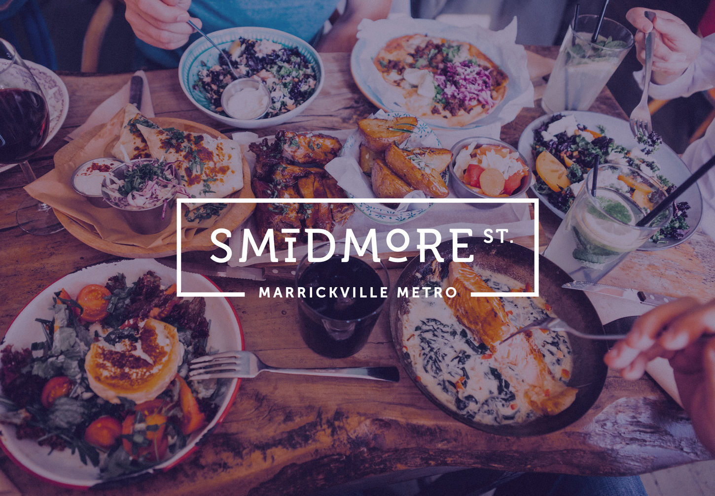
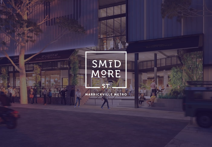
Smidmore St is a new eatery precinct located within the vibrant Marrickville Metro mall in Marrickville, Sydney. A hub for food lovers, it offers a diverse selection of dining options, bringing together local flavours and culinary experiences in a trendy yet community-centred environment. The precinct is housed in a building with a rich history, marked by its iconic heritage brick wall facade.
Client
AMP Capital
Year
2019
Agency
Protein
Scope
Brand Identity
Brochure
Website
Brand Guideline
AMP Capital approached Protein to create a brand identity that celebrates both the modern, dynamic atmosphere of the precinct and the rich historical character of its location.
As the design lead, my challenge was to create the new identity along with promotional materials such as brochure and website.

The Approach
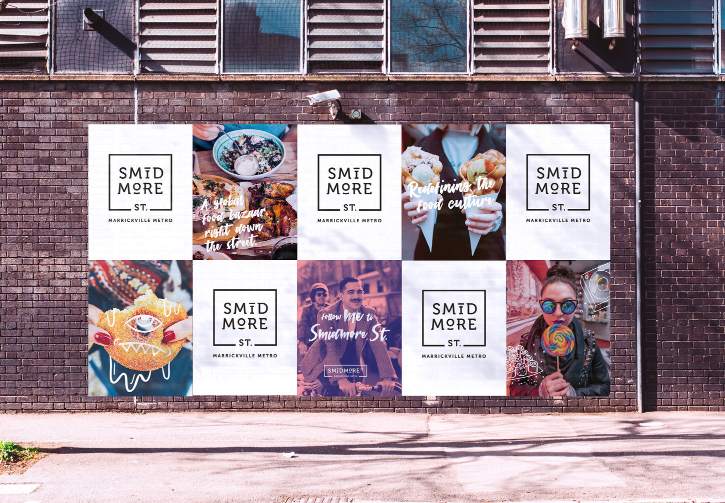
The logo features a distinct border, symbolising the location of Smidmore St within the Marrickville Metro. This border acts as a frame, uniting the elements of the brand and giving it a sense of place and belonging within the mall and surrounding community. The combination of typography and border visually connects the eatery precinct to its historical roots, while also conveying a sense of modernity and inclusivity.
To give the brand personality, we added hand-drawn illustrations that interact with cool, hip-looking photographs. This playful touch sparks humor and imagination, adding a fun, creative energy that speaks to the youthful, vibrant vibe of Smidmore St. The illustrations create a visual dialogue with the photos, making the brand feel dynamic and approachable while reinforcing its modern, eclectic nature.


